https://99designs.com/blog/tips/logo-color-meanings/
Logo colors: what’s best for your brand?
by Kelly Morr
electing a color palette is one of the most impactful choices you can make while developing your brand aesthetic. Choosing the right logo colors can highlight your business’ strengths and help you attract the right customers. And, as you might guess, the wrong combination can have the reverse effect.
Everyone has heard of color psychology, which tells us that colors impact our emotions and behaviors. yellow is cheerful (because the sun is bright and yellow!) and green is calming (like laying in the grass and looking up at a bunch of leaves is peaceful). But do these “rules” really translate into logo color meanings?
Researchers Lauren Labrecque and George Milne looked into that and foundthat some do and some don’t. So yes, yellow will make your brand look youthful and approachable, but a green logo doesn’t inherently make customers think your brand is peaceful. Does that mean if you want to intelligently choose a logo color scheme you have to read and and interpret a long academic study?
Nope! We did that for you. And turned it into a handy infographic quiz. Just answer a few fun questions about your brand and we’ll tell you which logo colors you should think about using.

Want to share this infographic on your site? Copy and paste the embed code below.
What does your brand stand for?
—
Nobody knows your business—its strengths and goals—better than you. Before picking your logo color scheme, think about the message you most wish your business to convey. First, look at your brand’s personality. What virtues do you want to highlight? Speed, bold innovation, efficiency, compassion, intuitiveness? Knowing the tone can go a long way to refining your color choices. Research shows us that blue hues, for example, emphasize competence, while reds make you appear bold and energetic. A company that provides in-home care for seniors will likely have a color palette unlike that of a company that makes auto parts. The infographic above is designed to help you identifying key brand personality traits, which are essential in finding the most successful logo colors for your company.
Which logo colors mean what?
—
Red
The universal sign of excitement, passion and anger. Is your brand loud, playful, youthful or modern? Think red. More mature, classic or serious? Red may not be for you.
Orange
An invigorating, playful color. Go orange to stand out from the crowd. It’s used less often than red, but still packs an energetic punch.
Yellow
Accessible, sunshiney friendliness. Yellow exudes cheer, and your brand will radiate an affordable, youthful energy. Nobody puts yellow in a corner!
Green
The ultimate in versatility, green isn’t linked with many brand personality traits, but it has strong cultural associations. Are you in finance? Gardening? Consider going green.
Blue
The classic king of colors, blue appears in over half of all logos. As it symbolizes trustworthiness and maturity, true blue will make sure you’re taken seriously.
Purple
Where the rainbow gets luxurious. Paint with purple to appear simultaneously cutting-edge and wise. There’s just a hint of femininity in there too.
Pink
Nothing says “girly” quite like pink. But it’s more versatile than that. From pastel rose to neon magenta, pick pink for a modern, youthful, luxurious look.
Brown
What can brown do for you? Make your brand appear rugged, masculine and serious. Brown is very underutilized, so you’ll stand out from the competition.
Black
Black is the new black. Want to look slick, modern and luxurious? Time to go black. Rather be economical and affordable? Stay away from the dark side.
White
The absence of color. White is youthful and economical, but can work for almost any brand. As a neutral color, consider white as a secondary accent.
Gray
Not quite dark, not quite light. Gray is the middleground of mature, classic and serious. Go darker to add mystery. Go lighter to be more accessible.
You don’t have to pick just one!
—

Remember that you are not limited to one color. If what you choose to emphasize about your business is its variety of products (like eBay) multiple colors are a great way to show that diversity. Similarly, choosing two or three specific colors can highlight what makes you unique. The original Coors banquet logo pairs a golden brown—which not only is the color of beer but is a combination of masculine brown and affordable yellow—with a mature blue wordmark. This is perfect for their target customer. Don’t be afraid to experiment before making your final logo color choices. See what works and what doesn’t. “It’s about the feeling, mood, and image that your brand creates. This is what plays a big role in persuasion, so colors come into play when they can be utilized to match your brand’s desired personality” says Matthew Roda in his recent article about psychology of colors.
Translate the language of color
—
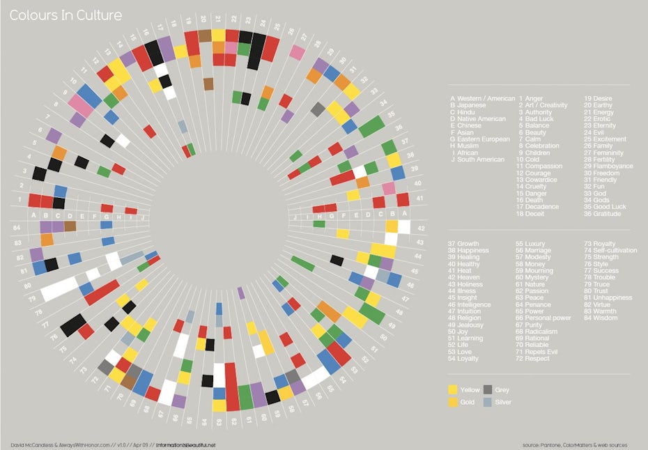
If your brand is international in scope, as so many today are, you should be aware of the symbolic meanings your logo colors can have when viewed in other cultures. A common example is the way white is viewed in most Western cultures as symbolic of purity while in some Eastern cultures as symbolic of death. A little foresight and cultural sensitivity can go a long way toward making effective color choices.

Stand out from the competition
—

The key to an effective logo is brand recognition. So if you want to stand out, it’s a good idea to choose a color palette that differs dramatically from those of your largest competitors. Ford Motor Company, for example, introduced its famous blue oval nearly a century ago, and it remains a powerful brand identifier as well as a symbol of the company’s reliability. By contrast, Land Rover, while employing an oval design element in its logo, uses a forest green palette to emphasize its adventurous off-road feel.


